Project: Brazil's website
Despite being a worldwide brand, Subaru doesn’t have a great market penetration in Brazil.
As they were working on a new brand positioning, Casion was given the task of creating their new website. I worked as the UX Lead and, during the development, I was responsible for the project management.
about the project
Subaru isn't a popular brand in Brazil. The objective in 2018 was to prepare their digital scenario to increase their market share along the year.
Our first task was to understand what makes Subaru special in front of other brands. We've worked with their ad agency to achieve that, always working side by side with CAOA's marketing team (the importer of Subaru in Brazil).
The main KPI of the website was to increase the number of contacts for proposal and test drives.
the process
What we did to get the project up and running:
Understanding the company is crucial to help you build something valuable to its core business. So we were immersed in CAOA and they taught us all the models and features of their cars, differentiator and what Subaru thought it was important for their clients.
CAOA let us interview some of their actual clients and prospects at their dealerships to build a solid persona that would help us in the entire UX process.
We prepared an accurate benchmarking with national and international brands.
Also, we set a Heuristic Evaluation of the Brazilian’s website and other countries from LATAM.
After these processes were done, we set a workshop with CAOA’s stakeholders to bring new ideas to the table. We got many ideas that would require structural changes on a company level, but some of them were used in the current platform, such as connecting the website with their ERP for solving most of their agility problems in sales and customer service.
Once we had all this information in hand, we started prioritizing what fulfilled the users needs and, simultaneously, the company objectives. Simplicity was something that we looked for in the website’s structure, allowing the user a fast recognition of all the information Subaru has to offer in its main communication platform.
After the first version of the sitemap was built, we started the building of the responsive prototype to get user feedback as soon as possible.
After a few rounds of validation with user using the low fidelity prototype, we started work with the new key visual. Once the “look and feel” was ok, the frontend team started integrating the visual with the backend developed by Casion.
In this project, I was also responsible for the whole tagging plan, so the development team could prepare the code for the BI team to implement the tags using GTM (Google Tags Manager).
achievements
As direct results of our work, the highlights are:
Request for information had a 41% increase and were answered in half the time compared to the previous website.
Increase of 24% of Test Drive schedules.
More assertive search for dealerships and maintenance offices all over the country with a smart system of geolocation.
Greater speed in the resolution of recalls of the most diverse models of cars.
nice to know
Other results from the good work done:
The simplicity of the website enabled a new perspective to CAOA’s marketing team of the UX process. They now are assembling a Customer Experience Team in progress to extend the mindset to all the brands they work with (such as Hyundai, Chery and others).
let's get visual
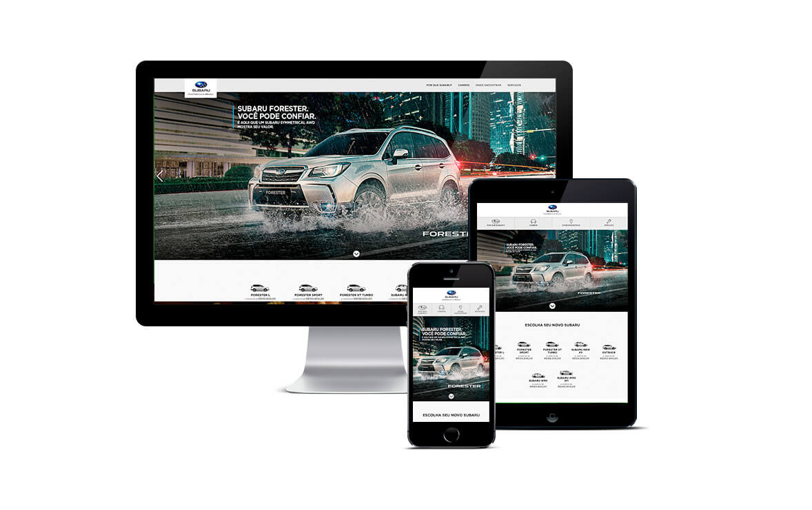
Final version in mobile, tablet and desktop.
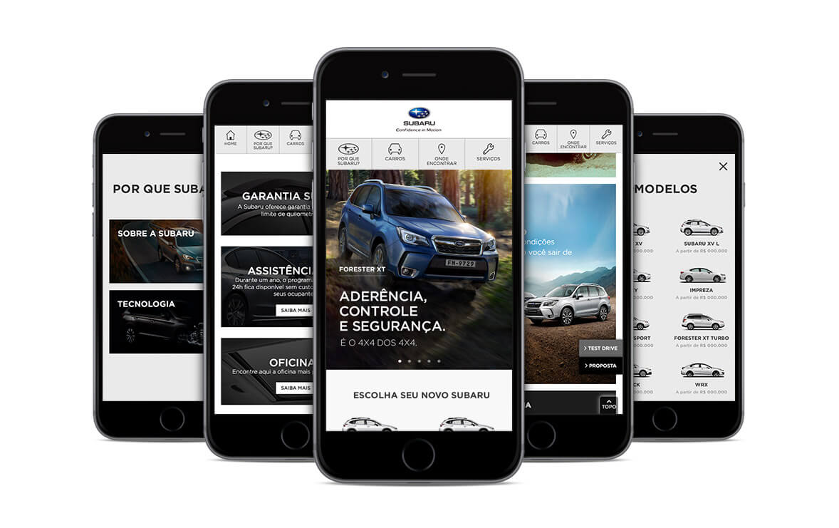
A few parts of mobile version of website.
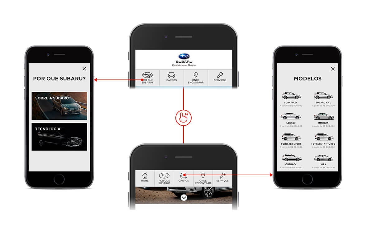
User testing showed us that a simple menu with modal-like submenu worked better than hamburguers and other options.
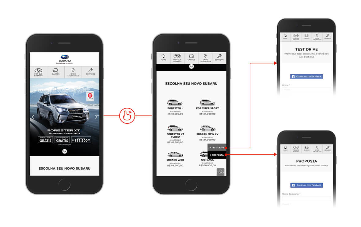
We fixed the 2 buttons on the right side of the page that appeared according to scroll position, taking users directly to the "Test Drives" and "Proposals" forms from anywhere in their navigation.
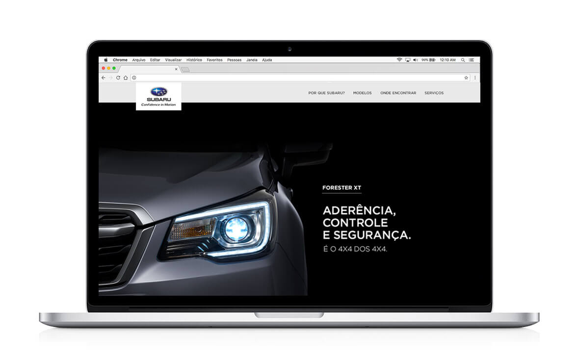
Homepage of the desktop version with the top-fixed menu.
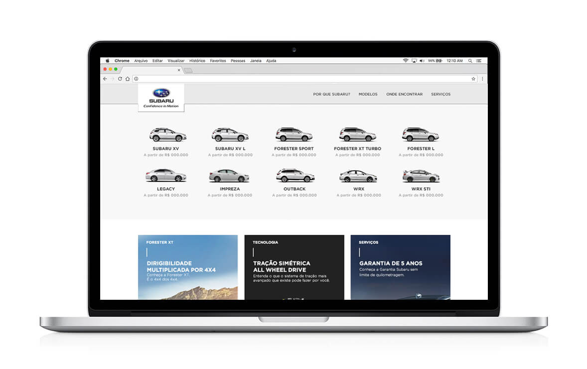
Desktop version showing all the vehicles with prices and conditions.
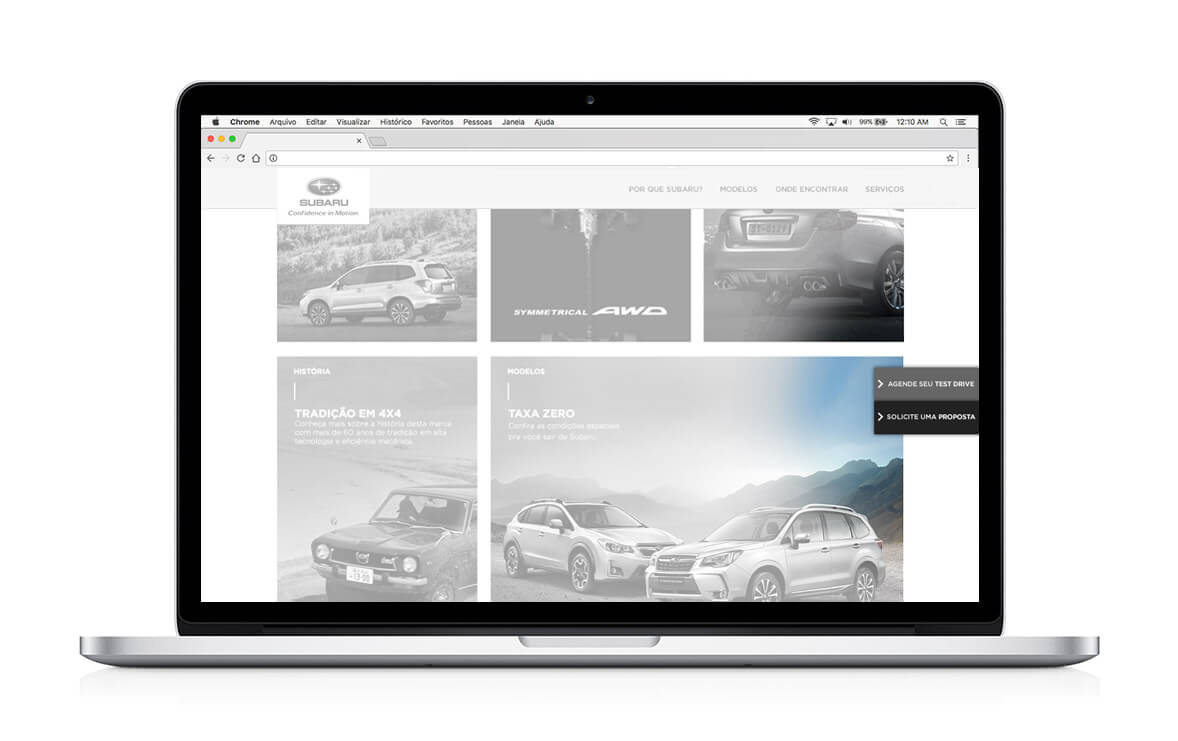
CTA for "Test Drive" and "Proposal" also in the right side of page (like the mobile version), taking user to their respective forms.
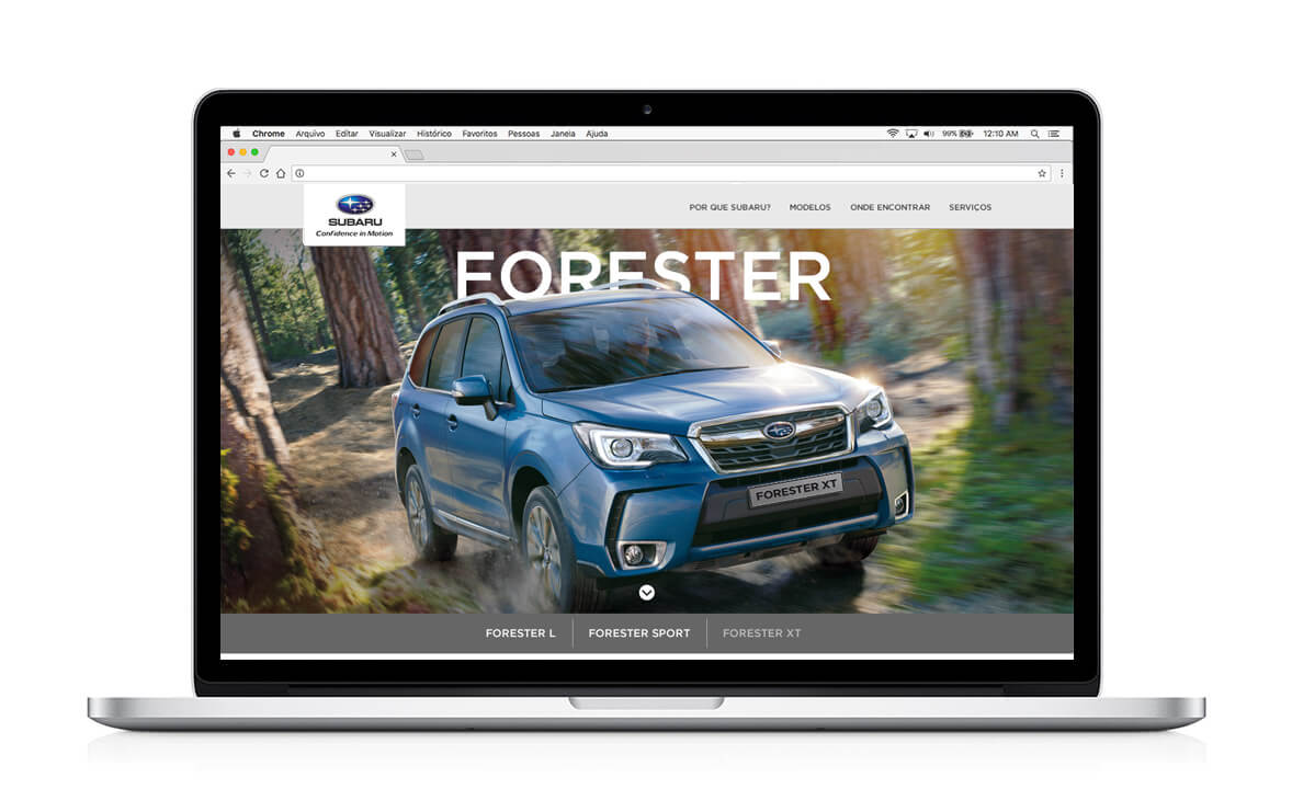
Each vehicle has its own page that worked as a landing page with details that would help the users decide easier which Subaru was best for them.
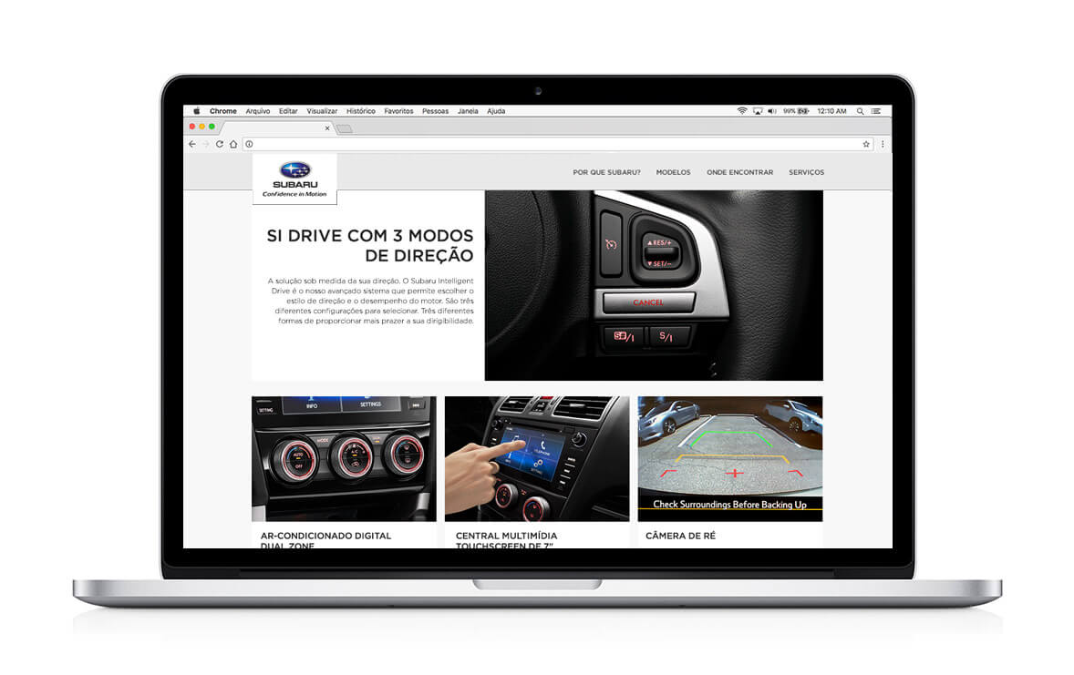
Modular blocks of vehicle's differentials showing Subaru quality and top technology.
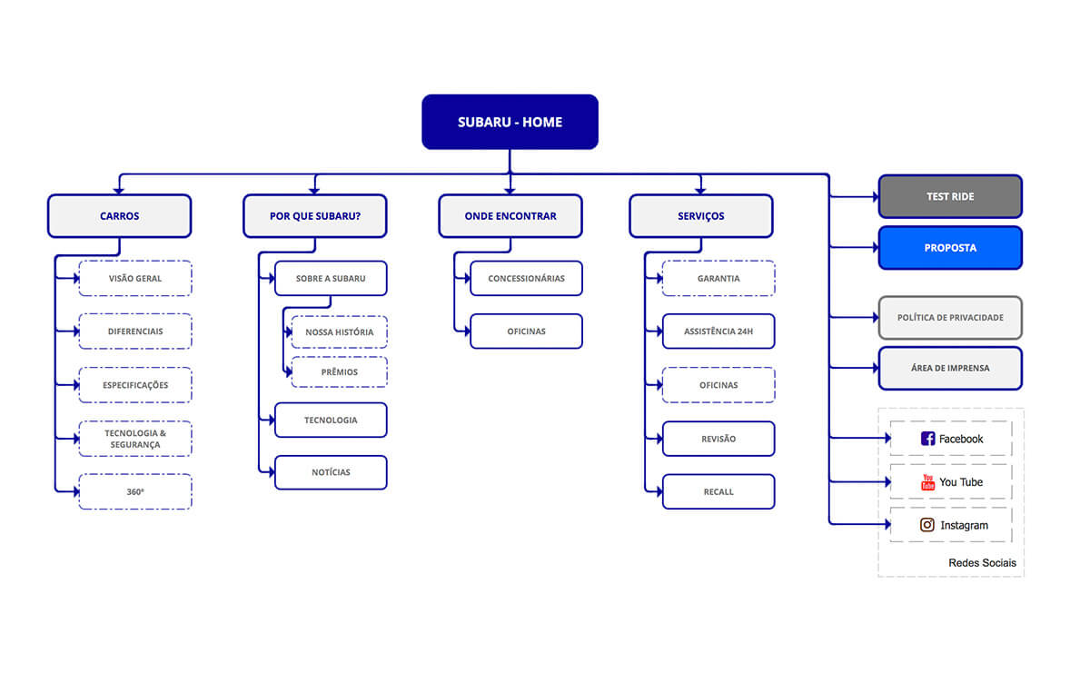
This is the flow of the solution. You can take a look at the responsive prototype using the link bellow: Responsive Prototype (HTML/CSS/JS)