Project: GPS Mata Atlântica
SOS Mata Atlântica Foundation is a non-governmental organization that is active in the conservation of the country’s most threatened forests and associated coastal and marine environments. The Foundation seeks to ensure sustainable development and quality of life for human beings.
The project GPS Mata Atlântica was conceived thinking about the small attitudes that could soar throughout the entire local environments of their creators. That's why their platform should show their projects using images or a video. The campaign had many celebrities presenting some of the projects in a video case.
about the project
Having an organic platform was something very important to SOS Mata Atlântica. The previous website was not working for several reasons related to usability and technical issues altogether. The idea was making structural changes so the project could achieve the expectations of the stakeholders.
Being a non-profitable organization, we had to change our mindset to get the results we needed. Working with their Marketing Team in the process was very important.
The main KPI of the campaign was the number of new cases registered in the platform.
the process
What we did to get the project up and running:
The Google Analytics was not implemented in the best way, but we were able to see that the bounce was too high (almost 90%). The mobile conversion was almost non-existent.
Although it had a good aesthetics, the register process was unstable, the images and animations were very heavy and the mobile version didn't work properly. We've interviewed a few users that were able accomplished the process of registering their projects in the first platform and they've all had to try a couple times before getting it done successfully.
Mixing new users and the ones we interviewed, we started with a card sorting to understand the best structure for the new platform. With that, we created a new sitemap that would be our guide our future decisions.
Once we did a content analysis, we noticed that there wasn't much institutional information that needed to be at the page. So, we made the decision to proceed with a single-page solution.
We built the responsive mobile HTML prototype first and set some user tests up. Aside for a few adjustments in components, the single-page revealed to be a good decision.
We created a new key visual that would be used in all project communications. Once it was approved by SOS Mata Atlântica, we started the website "look and feel".
While Casion was developing the solution, we made another round of user testing and made some final adjustments to the aesthetic of the site.
After everything was done, we implemented a new tag plan using GTM (Google Tag Manager).
achievements
SOS Mata Atlântica was very pleased with the results:
The organization finally had a platform that worked properly and they could follow the results with an efficient Google Analytics tag plan.
We increased the registration of new cases in 57% in the first 3 months, having almost 60% of them done using a mobile device.
We reduced significantly the platform bounce: from almost 90% to only 34%, even with the campaign at its peak.
Having the search working fast and easily, the engagement got better with users exploring the projects and staying longer in the platform.
let's get visual
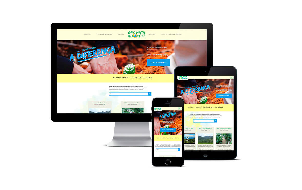
Final version in mobile, tablet and desktop.
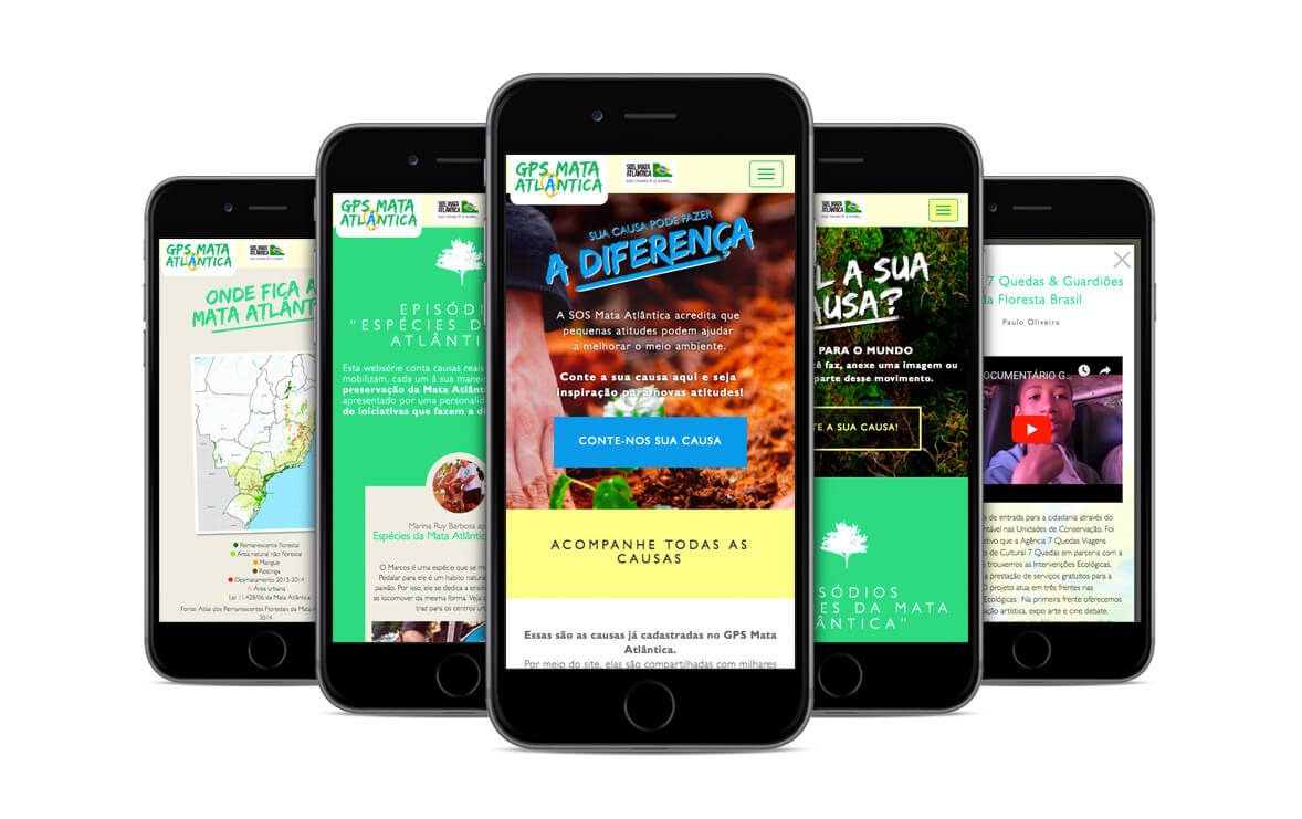
A few parts of the single page of the mobile version of website.
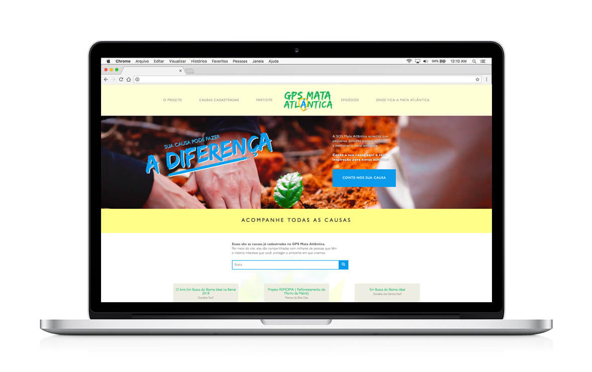
Desktop version at the top of the page.
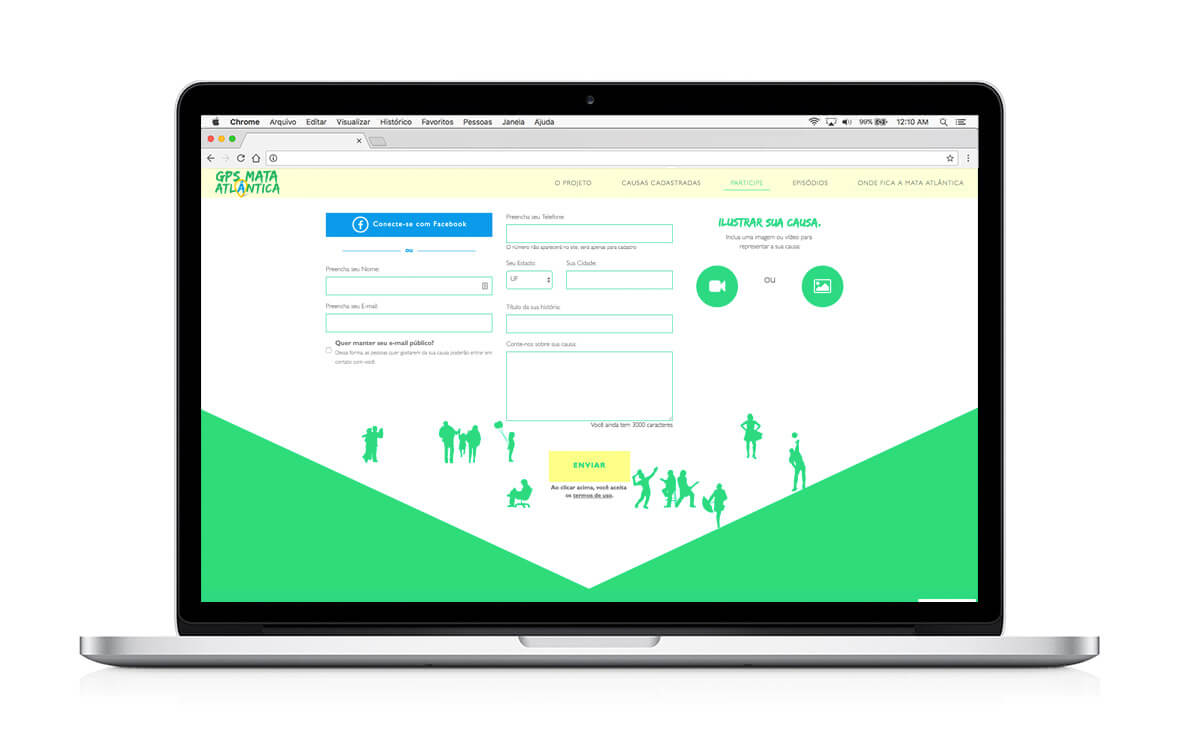
Register form.
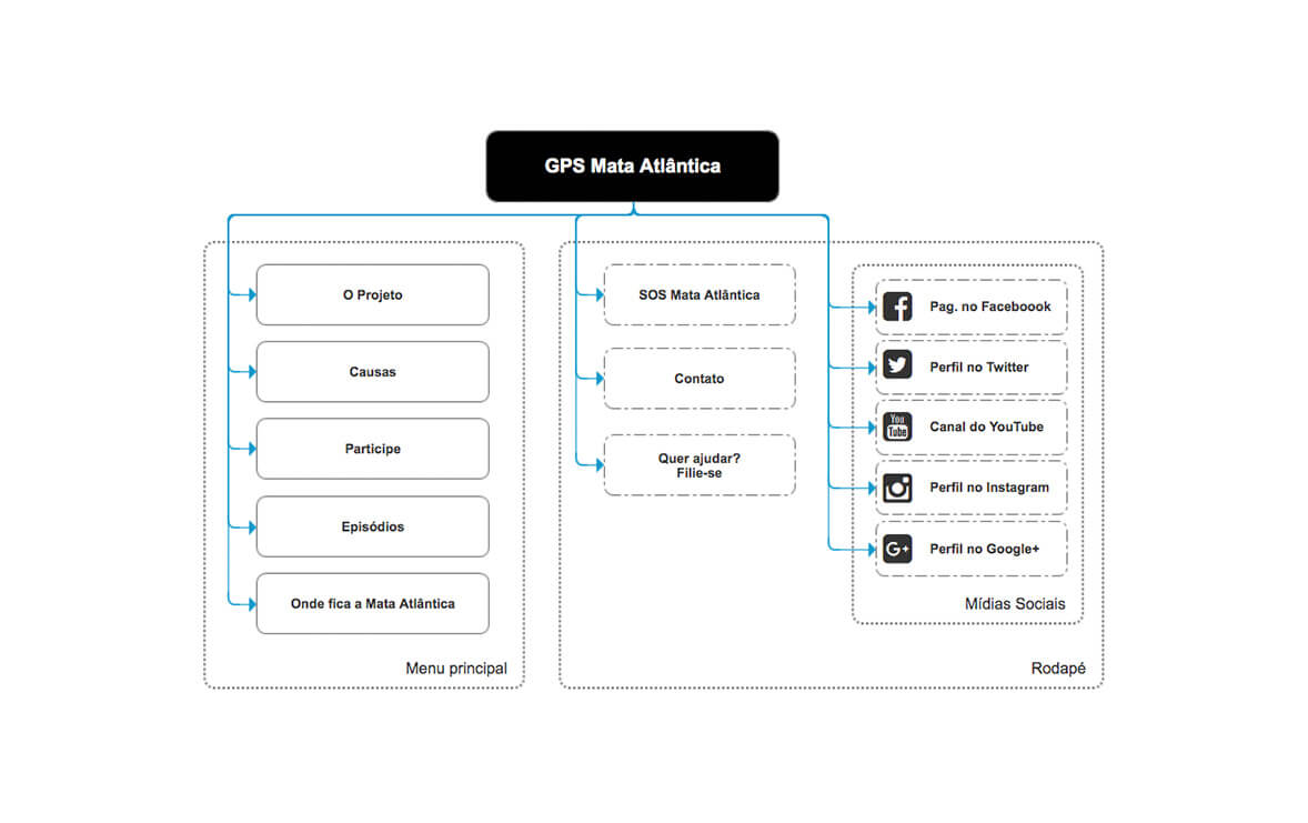
This is the sitemap of the solution. You can take a look at the responsive prototype using the link bellow: Responsive Prototype (HTML/CSS/JS)